Project
Icemint
A playful, premium ice‑cream identity that scales from shelf to screen.
Scope
- Logo design
- Packaging
- Typography
- Colors
- Assets
Industry
Ice Cream Vendor
Client
Tammy, Icemint, USA

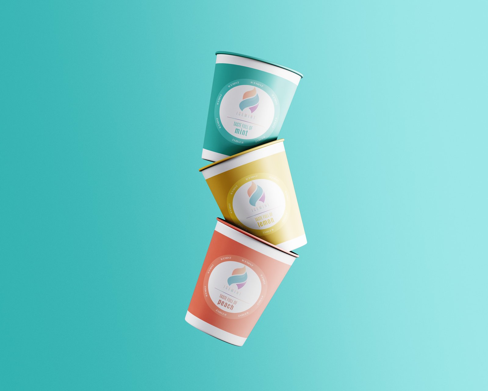
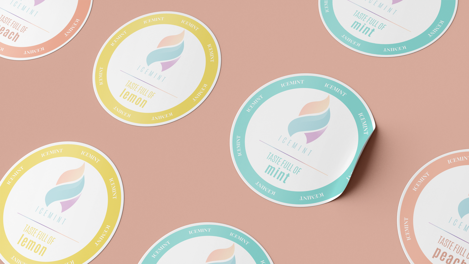
ice cream cups
Minimal design for maximum flavor.
We designed a simple logo system that stretches from product micro‑sites to delivery packaging. Color ramps carry the flavor; the type carries the brand-clean, confident, and legible at a glance.

System
A minimal grid with playful edges.
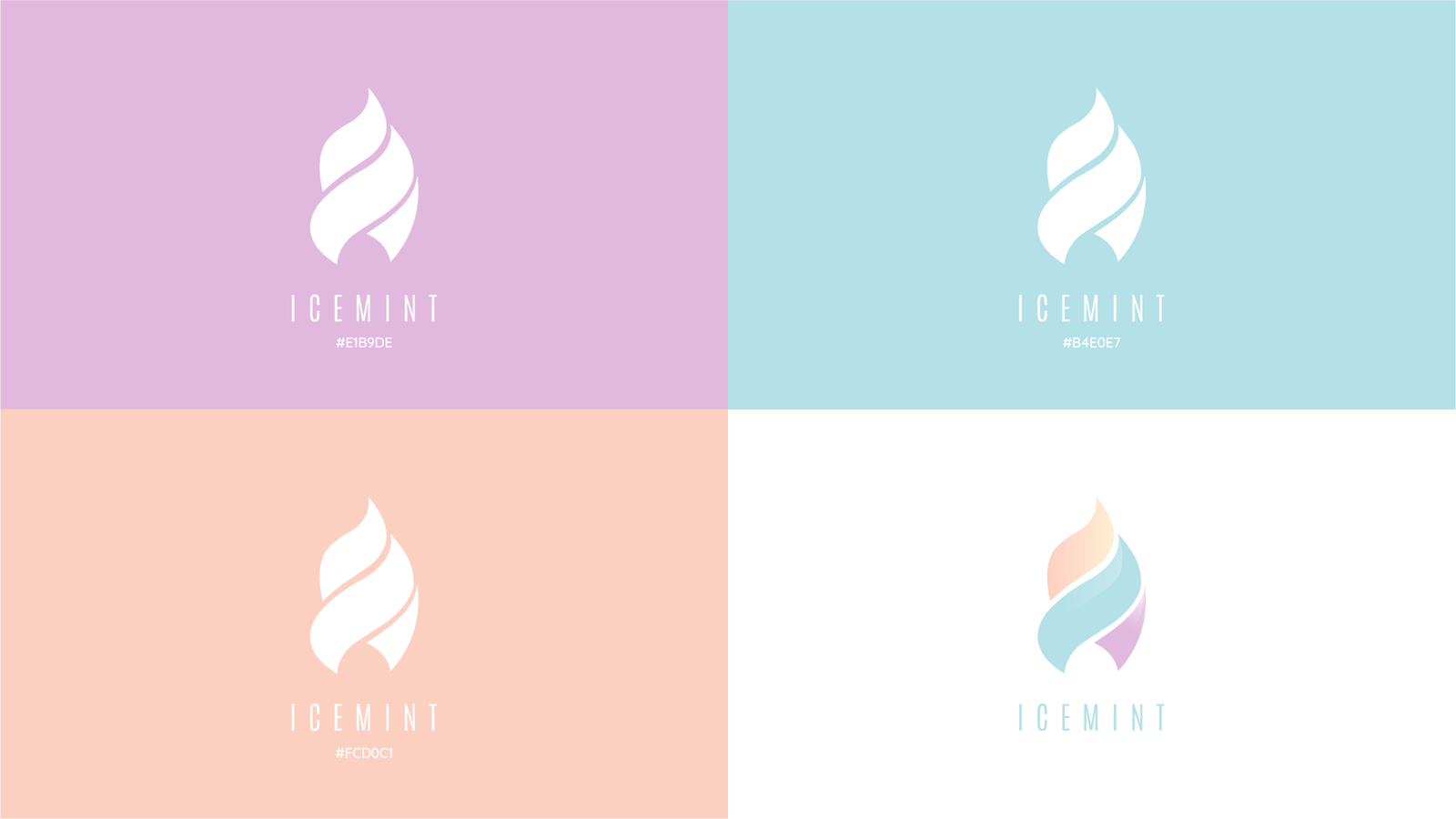
We built the Icemint logo on a strict grid, softened with curves to keep it fresh and approachable - minimal, confident, and instantly recognizable.
-
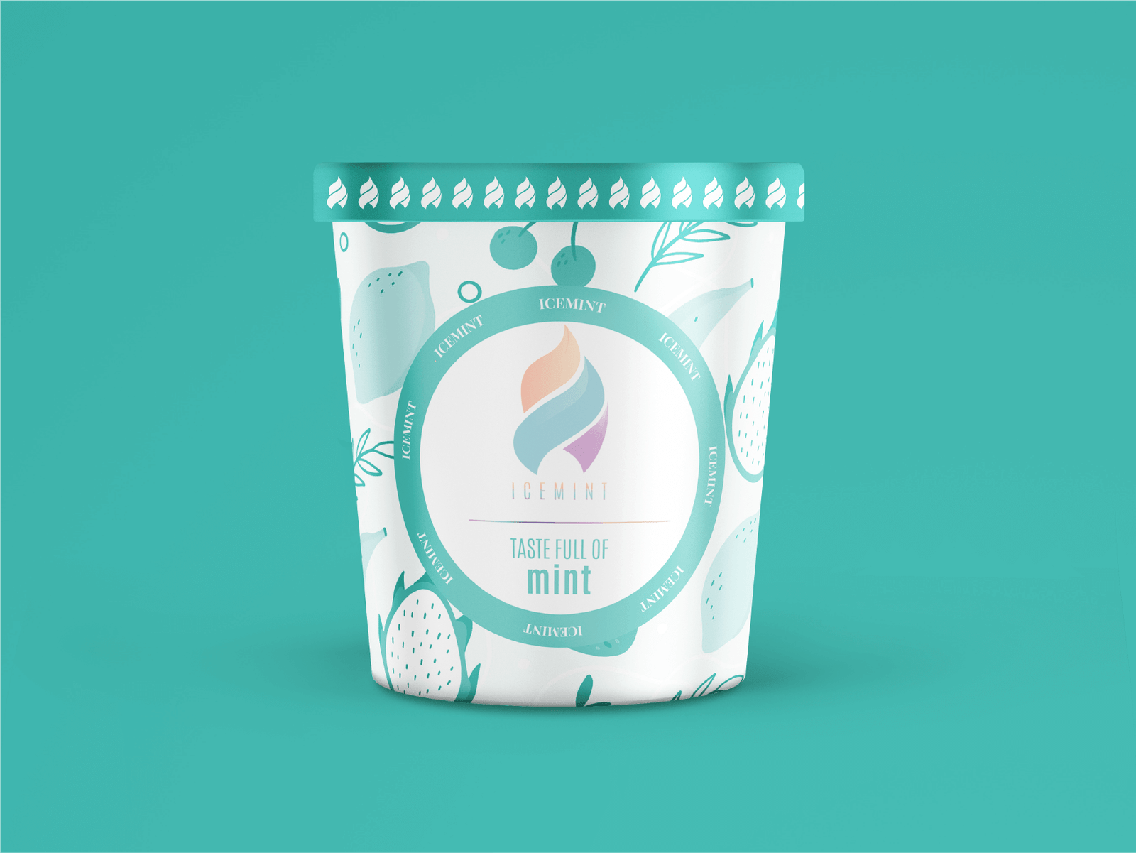
Mint
Cool + crisp
-
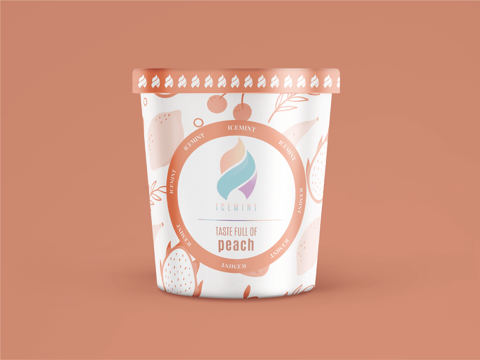
Peach
Soft + mellow
-
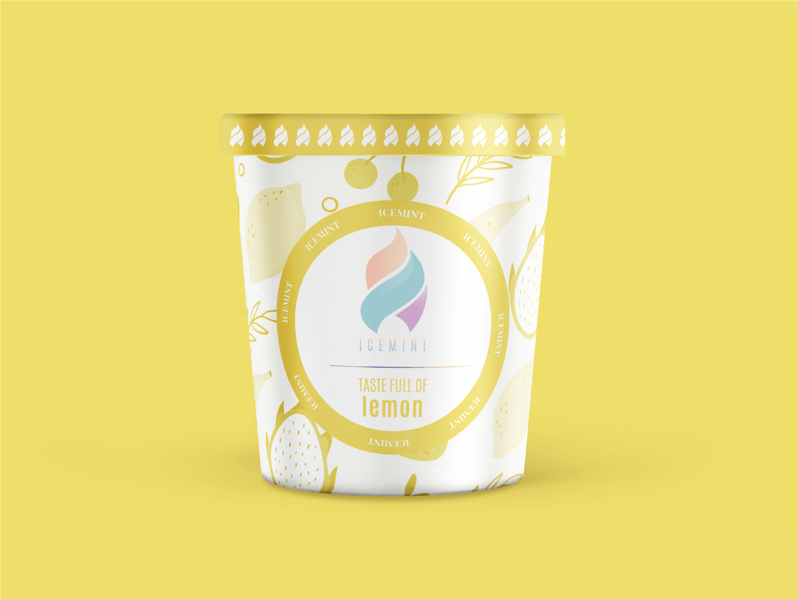
Lemon
Bright + zesty
Flexibility in play
The identity system adapts across packaging, digital, and print.
Geometry as structure
Every curve and proportion comes from a grid for consistency.
Color as language
Each flavor carries its own hue, giving variety in a cohesive system.
Other projects
-
Zoeble
Branding
-

Career Path
Full Identity
-

Freedom Designer
Logo
Every brand has a beginning.
Let's start yours.
Quick Start