The Anatomy of a Timeless Logo
Trends fade. A good logo doesn't.
The marks that last aren't the ones that chased what was popular - they're the ones built on principles that don't expire.
1. Simplicity first
The strongest logos are often the simplest. Instant to recognize, clean at any size, effective in black and white. Simplicity isn't a limitation - it's what makes a logo durable.
2. One thing to remember
Memorable logos usually have one distinctive element - a shape, a detail, a visual idea that sticks. Not five things. One. That's what people carry with them after a single glance.
3. Built for everywhere
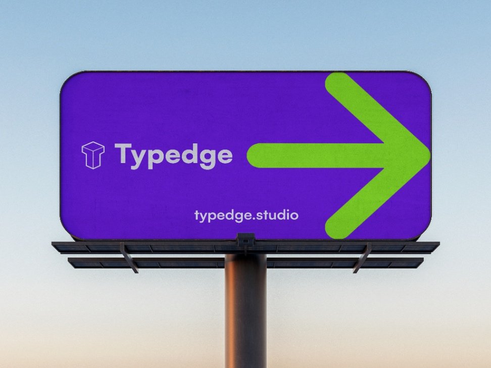
A logo needs to work on a phone screen, a storefront, a business card, and a billboard. If it falls apart without gradients or effects, it's not ready. Test it in every context before you commit.
4. Relevant, not trendy
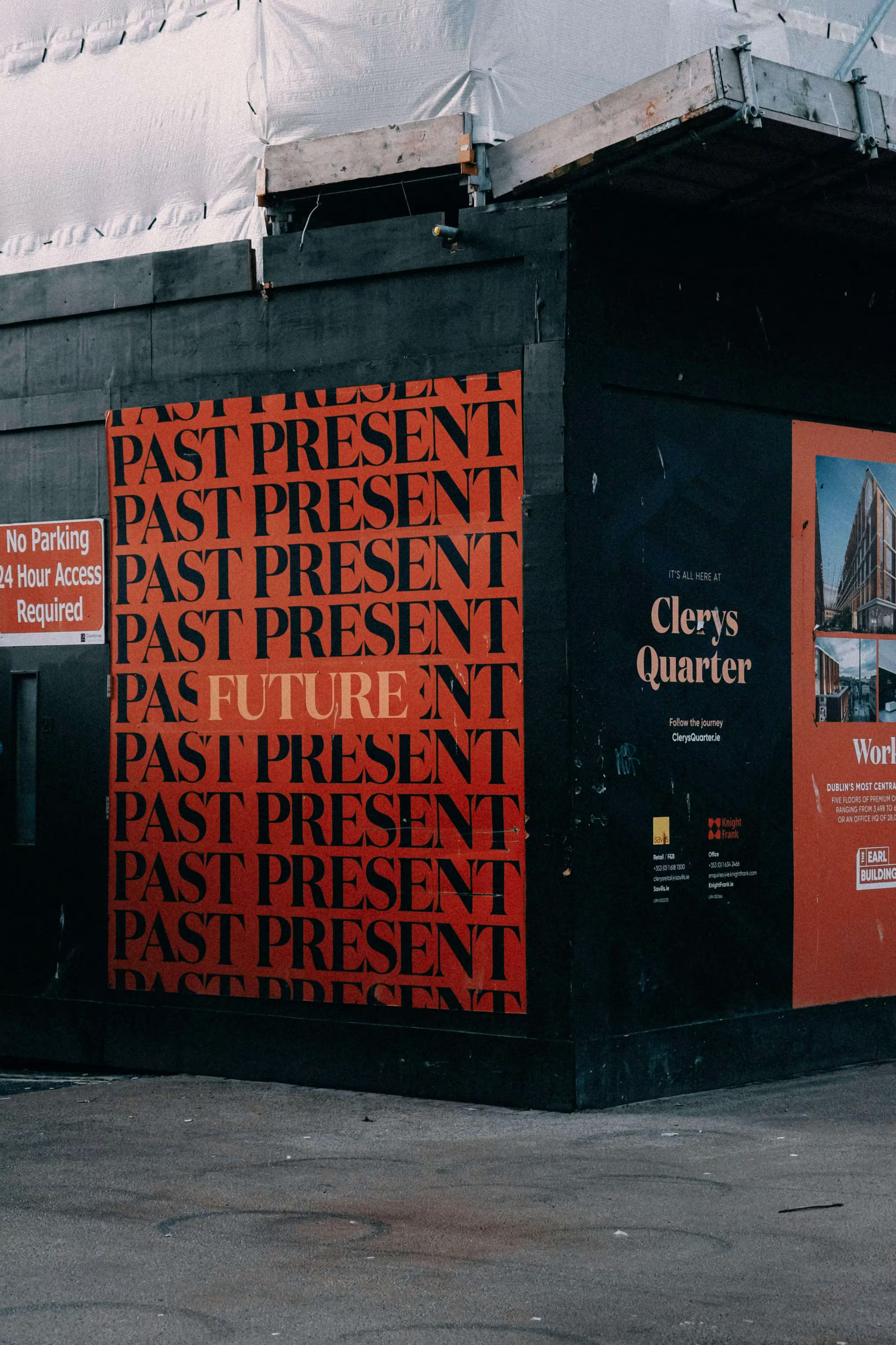
A logo that looks like this year will look dated in three. The goal isn't to be current - it's to be right for the brand. When the design reflects real values and a clear identity, it stays relevant long after the trend has moved on.
5. Craft matters
Proportion, spacing, alignment - these aren't finishing touches. They're the difference between a logo that feels polished and one that feels off without anyone knowing why. The fundamentals are what make a mark trustworthy.
The takeaway
Your logo is often the first thing people see and the last thing they remember. Get the foundations right - simple, distinctive, versatile, and well-crafted - and it will represent your brand for years without losing its edge.
←Back to insights